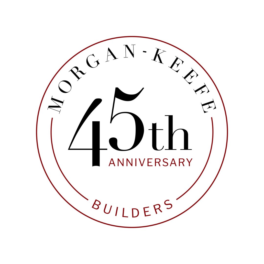
VNM's creative team partnered with luxury homebuilder, Morgan-Keefe, to develop a brand celebrating their 45th anniversary. A suite of accompanying collateral allowed the anniversary graphics to be used throughout digital and print platforms.
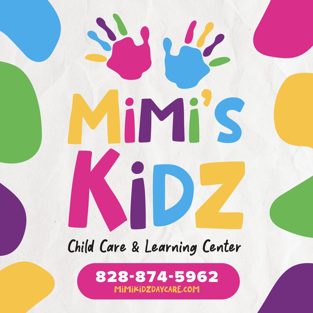
VNM was delighted to partner with longtime friends, Kevin and Tomica Dixon, on the branding for their new business venture, Mimi's Kidz. A bright and playful logo, signage, and web presence announced the child care and learning center coming soon to downtown Valdese, NC.
This new logo VNM designed for Catawba Valley Staffing includes a clean sans serif font, abstract symbol, and new tagline to usher the multi-generation staffing agency into their next chapter.
Our creative team was delighted to develop a new brand identity for Inner Harmony. Embodying calm and healing vibes, the new logo features custom lavender artwork and tagline.
VNM was stoked to partner with home decor retailer, Vintage Editions, on a new visual identity for their brand. The elegant, modern serif font paired with a custom woodgrain graphic captures the essence of their unique, handcrafted wood products.
Check out the new logo we designed for a local caregiving provider, Gateway Human Services. The new brand package we developed included a variety of logo files, brand colors, font packages and everything else Gateway needs to complete their visual makeover.
A provider of natural CBD and herbal products, Ratoon was in need of a visual brand identity to launch them into the retail marketplace and ecommerce channels. VNM's graphic design team delivered with this custom logo and full brand package including fonts, colors, supporting graphics and social media templates.
VanNoppen Marketing teamed up with global web security leader, OWASP, to develop a cohesive and complete brand package with a variety of templated assets for their chapters across the world to use.
As part of Bluebird Farm's rebranding, VNM's creative team developed a new logo, typeface, signage, vinyl banners and print materials for farmers market booths that promote Bluebird's farm fresh meats and produce.
Visit Little Switzerland’s previous logo was outdated and did not capture the essence of the community. VanNoppen Marketing created a new brand that is modern, appealing to dynamic audiences, and conveyed the unique location on the Blue Ridge Parkway. A supplementary brand guidelines package with fonts and colors helps member businesses and community partners keep branding consistent.
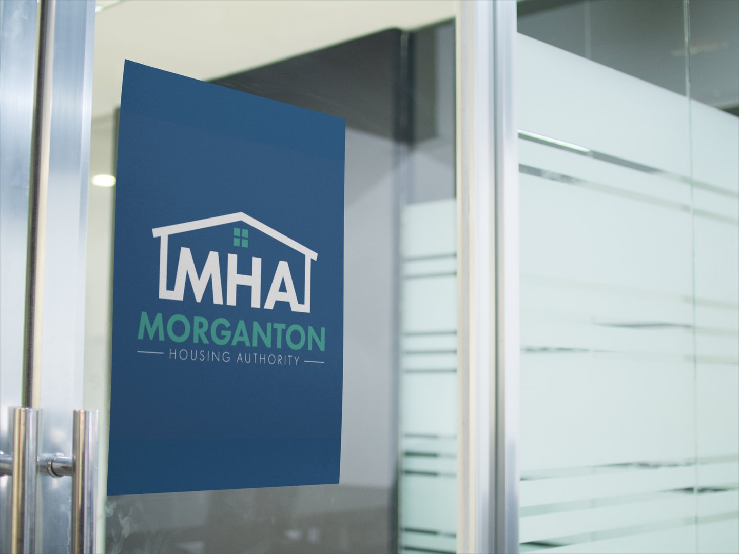
VNM designed a new logo for Morganton Housing Authority to elevate their visual brand in the community. The new design incorporates a modern font, clear representation of housing, and a blue and green similar to other government programs in the area.
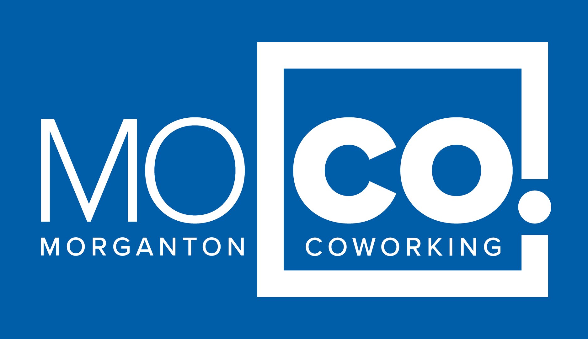
Our team was stoked to partner with the new Morganton Coworking space, MOCO, on their brand identity. VNM's strategic and creative teams collaborated with the MOCO Advisory Committee to develop the name, tagline, logo and graphic standards for this exciting new space coming to downtown Morganton!
VNM was delighted to partner with a new client and old friend to develop the brand identity for CC Storage, a new climate-controlled, self storage facility coming to Hickory, NC. The brand features a unique font and custom graphics inspired by a box and the iconic self-storage roll up metal doors.
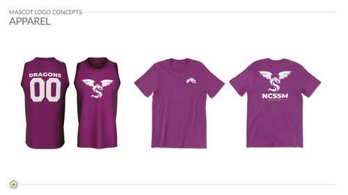
VanNoppen Marketing was delighted to be chosen to develop the new mascot logo for NCSSM-Morganton: Home of the Dragons. Our creative team worked with NCSSM staff and students to create a fierce dragon logo to represent the school's fiery new mascot.
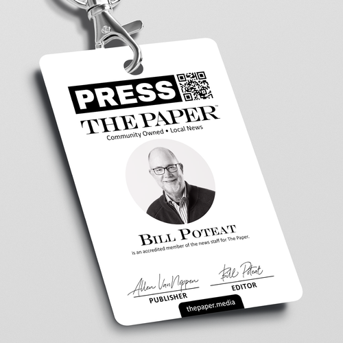
Naturally, VanNoppen Marketing was thrilled to develop the branding for local startup, The Paper. A community-owned local newspaper, The Paper's new logo incorporates historic buildings from downtown Morganton with a bold modern serif font.
In conjunction with a new website, Stone & Leigh partnered with VanNoppen to update their visual brand identity with a new logo featuring a modern font and reimagining of the historic architectural artwork that has been critical to their brand story.
We developed a clean, type-based logo for non-profit startup, Western North Carolina Journalism Foundation. Based in Morganton, WNCJF supported independent, local newspapers such as The Paper.
After two decades, historic venue Morganton Community House was in need of a logo update. Our creative team developed a new brand package featuring a modern serif font logo with a rendering of the building's signature cupola set inside the O.
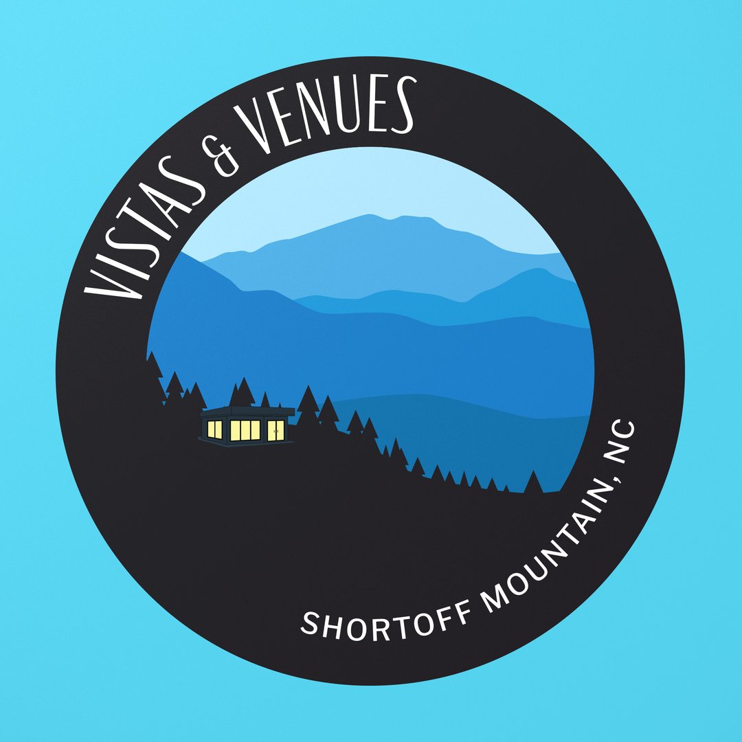
Vistas & Venues offers a selection of vacation rentals and adventure experiences around Shortoff Mountain. The VNM creative team had a blast designing their new brand with custom artwork.
In conjunction with a custom website, VanNoppen developed a new visual brand identity for Surry Scenic Bikeway, over 500 miles of designated cycling routes through Yadkin Valley wine country in North Carolina.
After partnering with Gray Stout on our new office design, VanNoppen Marketing was delighted to assist Gray in developing a new brand for Stout Studio Architecture. We designed a clean, type-based logo and brand package that included business cards, letterhead, envelopes, email signature and other print materials.