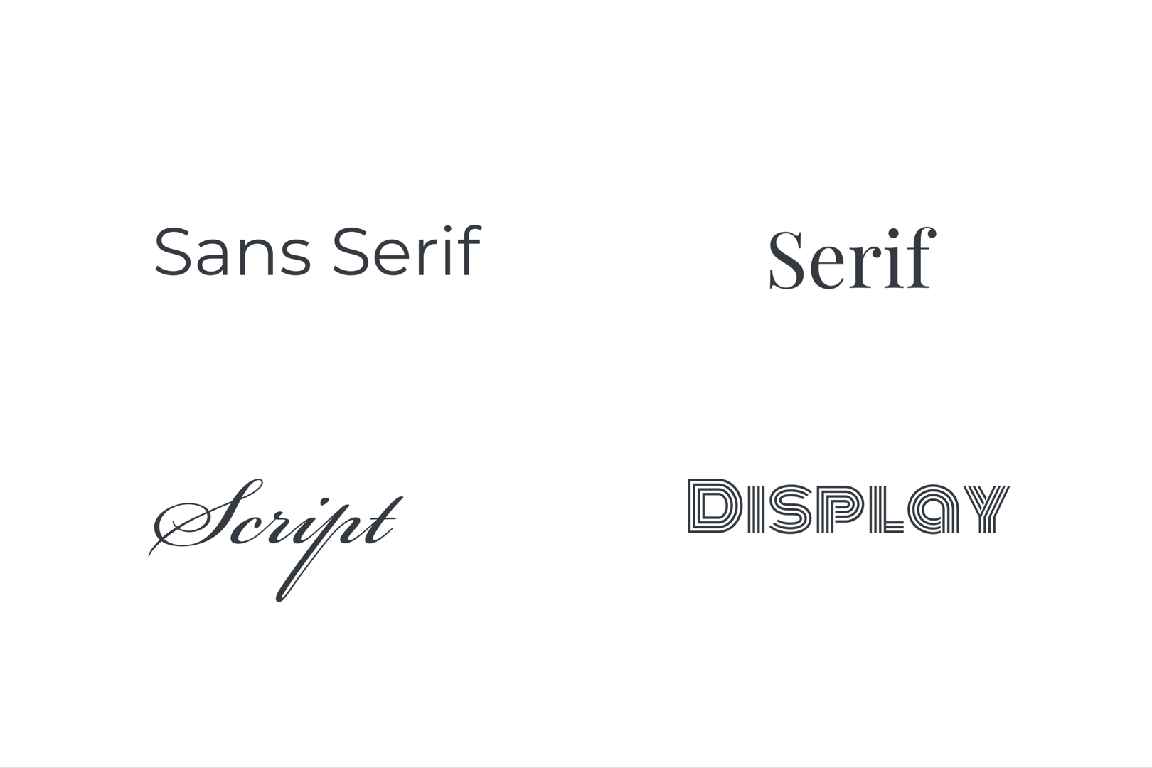
In today's crowded marketplace, a company's logo and brand font can make or break its success. The right choice can communicate the company's values, personality, and message effectively to its target audience, while the wrong one can turn off potential customers and hinder brand recognition.
Let's take a closer look at the different fonts and the signals they send to users.
Serif fonts are known for their traditional and authoritative look. They are ideal for companies that want to convey a sense of history, stability, and trustworthiness. Examples of companies that use serif fonts in their logos include The Wall Street Journal, Vogue, and Tiffany & Co.


Sans-serif fonts, on the other hand, are more modern and youthful. They are perfect for companies that want to appeal to a younger, hipper audience or those looking to create a more relaxed brand personality. Examples of companies that use sans-serif fonts in their logos include Airbnb, Google, and Spotify.

Script fonts are elegant and sophisticated, perfect for companies that want to convey luxury and exclusivity. They are often used by high-end fashion brands, perfume companies, and jewelry makers. Examples of companies that use script fonts in their logos include Cadillac, The Beverly Hills Hotel, Cartier.


Finally, display fonts are bold and attention-grabbing. They are ideal for companies that want to make a statement and be noticed. Examples of companies that use display fonts in their logos include Disney, Lego, and Yves St. Laurent.
An important note about display fonts is that because of their unique characteristics, they do not work well in small print. Most brands whose primary font is in the display category will utilize a complimentary sans-serif or serif font as their secondary typeface for brand materials.


All caps fonts are commonly used for logos that want to convey authority and dominance. They are ideal for companies that want to establish a strong and powerful presence. Examples of companies that use all caps fonts in their logos include TESLA, WELLS FARGO, and STARBUCKS.


All lowercase fonts, on the other hand, are more approachable and friendly. They are often used by companies that want to come across as down-to-earth, casual, and accessible. Examples of companies that use all lowercase fonts in their logos include amazon, android, and nutella.


In conclusion, choosing the right logo and brand font is essential for communicating the right message to your target audience. Each font has its own personality and can evoke different emotions and associations. By selecting the right font, you can create a strong and memorable brand identity that resonates with your customers and helps you stand out in a crowded market.
Check out some of our Brand Identity and Logo Development projects for more inspiration!