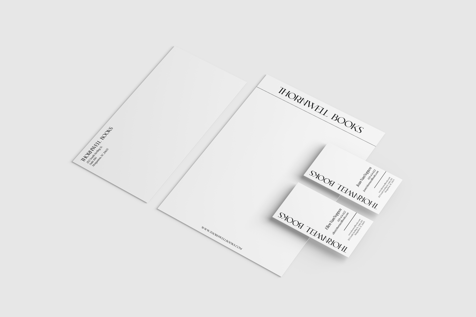
You hired VanNoppen Marketing to create a new logo for your business, we've finalized the new brand design and your VanNoppen Marketing project manager has just sent over the final files. You may be surprised when you open your email to find not a single jpg of your new logo, but an entire zip file with multiple folders, file types, logo sets and a brand guide.
Confused? This is what a new brand identity package looks like! It's not a single logo, but the beginning of an ecosystem of brand assets that will help your company maintain a consistent and cohesive visual identity.
You hired your nephew (who's great but still in high school) to create a logo for your new doggy daycare business, Barking Mad. You've finalized the design together (it features a line of hand drawn dogs in all shapes and sizes running across the words "BARKING MAD") and he's just sent over the final jpg.
Where's the first place you show off your new brand? Facebook, of course. But when you add the new logo as your profile picture, it gets cut off! You realize you need a square logo and type out a quick email to your nephew, who sends over another file with Barking Mad's line of dogs logo in the middle of a white square.
You drop the new file in and the whole logo fits, but it's so small you can't read it! You realize you're going to need a different, simplified version of your logo with just one of the dogs on it for your Facebook profile picture.
This example showcases the importance of having a Brand Identity Package. It provides you with logo variations, colors, fonts and guidelines so your brand is always consistent, professional and legible everywhere it appears.
Brand identity packages can be simple or complex depending on your business. A multi-location corporation with over 2,000 employees will need a variety of assets in their brand package for different departments and use cases, whereas a doggy daycare startup just needs the basics. Let's break down what goes into this glorious thing at the fundamental level.
As your company grows, your logo will be used in multiple places. Logo variations are modified versions of your primary logo that give you the flexibility to use it in different applications, formats and sizes.
This is your main logo, the one you had such fun collaborating with VanNoppen Marketing's creative team to design. Whenever you're able to, this will be the logo you use.
All your other logos will be a variation of this one that you can fall back on for situations where your primary logo doesn't fit.
If your primary logo is a vertical, circular or square composition, the horizontal logo is the opposite and formatted horizontally.
Use Cases: Letterhead, Financial Templates
If your primary logo is horizontal, the stacked logo variation is oriented more vertically.
Use Cases: Footers, Cards
The icon (or brandmark as it's sometimes called) is the most compact version of your logo and is typically formatted inside a square or circle. Icon logos do not contain words, but a graphic shape or select letters (like a monogram) that reference your primary logo. This will be the logo you use the most after your primary logo.
Use Cases: Profile Pictures on Social Media, Watermarks, Accents, Stickers
If your business has a tagline, your brand package will also contain a version of your logo that includes the tagline. Taglines can be slogans ("Just do it.") or descriptive ("Real Estate Broker").
When VanNoppen Marketing designs your new logo, we'll create a color palette for your brand. You'll have a primary brand color accompanied by secondary colors that compliment it and you'll need logos in full color, single colors and black and white.
Why the heck are there two files for every logo file, one for RGB and one for CMYK?
RGB stands for Red Green Blue and it's the colorspace used on screens. RGB logos are what you'll use for anything digital - social media, email signatures, etc.
CMYK stands for Cyan Magenta Yellow Black (K stands for Key, which is Black in the printing world, but don't ask us why because we'll have to Google it so you may as well save us both some time). You'll use a CMYK logo anytime it's being printed - business cards, signs, etc.
Your brand guidelines will contain an index of color codes for each of your brand colors in both color spaces, along with Pantone colors. Pantone is the holy grail of color and the truest representation of your brand's particular hue. If you're painting your lobby to match the new logo, take the Pantone color to the paint shop for mixing.
Perhaps the cornerstone of any visual brand, fonts are critical to maintaining your graphic identity throughout all your marketing. Any new logo project should include getting a set of font files from your designer.
A company's primary font is typically the one used for the company name in your logo. This font may be a unique typeface created just for your brand, or a licensed font from a type foundry.
Secondary fonts are handy for use in day-to-day use cases to supplement the primary font. Having a secondary font is important for making your marketing materials easier to read, as they can be displayed in a variety of sizes on print and screens.
For example, VanNoppen Marketing's secondary font is Lato, a web-friendly font we use here and on our letterhead, internal documents, pitch decks and advertising.
If you manage a large team or have lots of departments at your company, other brand assets may be developed in conjunction with your logo to ensure all materials, internal and external, have a consistent look and feel. These may include: